Third week of development
Hello!
We are now officially 3 weeks in the development of our game!
This time we have a working prototype, from which we will decide if it is good to greenlight the project!
This also means a lot of features that were not there before have been implemented, and decisions have been made on the look of the game.
UI joins in!
A basic concept for the in-game UI has been cooked up. It will display info such as: lives remaining, round timer and active power ups.
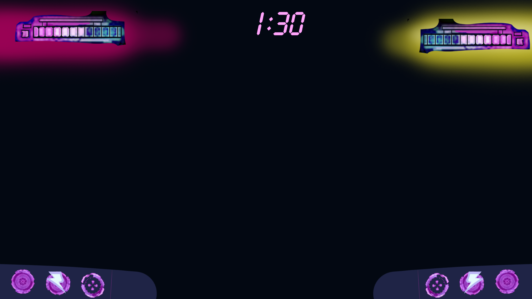
Colorful craziness
A first blockout of the colors that will be used has been made. They will be used in different ways than what is shown in the screenshot, but the general amount of each color will be like this. We really wanted to make the characters stand out from the rest and gave them very saturated colors.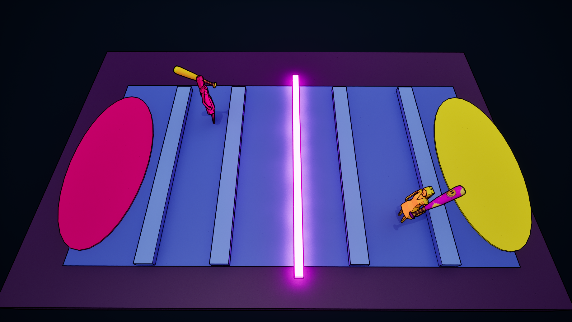 Now you might notice there is no cellshader in this screenshot. And this is true. It has been tested out and the cellshading didn't work out well with the rest of our style. The emissive lights that are center to our style fell flat on their face. We've decided to scratch it alltogether. A new outline shader has been added, though. It is cleaner and it is possible to vary line thickness based on distance to the camera. Like this we aim to create readable screens for the player.
Warning: Events are comming!
While the game is a work in progress with all gameplay comming together and slowly adding things week by week, it is important that the player (yess, you there!) knows what is happening. That is why these devlogs exist. But we also want our players to know what is happening in the game itself. Yess, you are right, I am talking about player feedback! We are slowly adding effects and other things that show you what is going on.
You probably have already heard about the small time events added last week, that spice up our gameplay. But now you can see them comming! Every time an event is about to happen, there will be a warning sign on the screen, telling you which event is commimg for you!
This is already a preview of how it is going to look like:
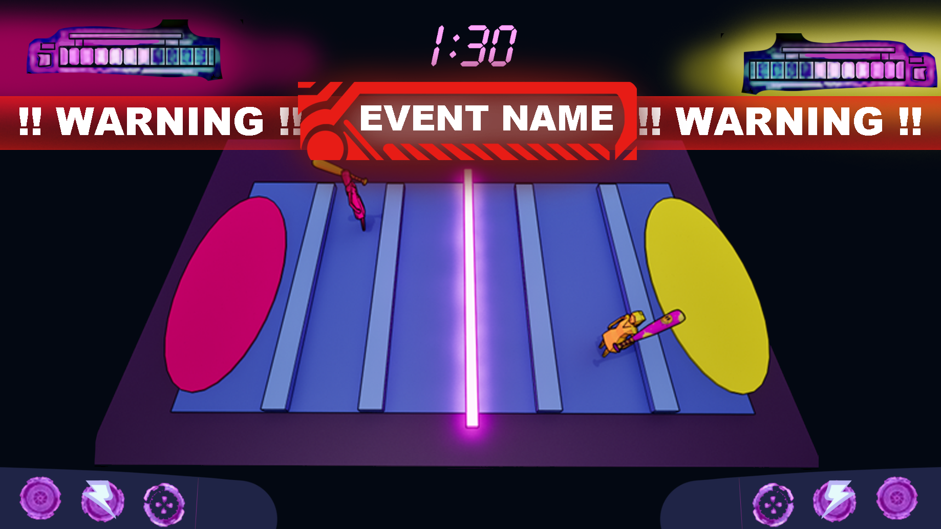
You can not miss it now! There will be more tweeks later!
This week's focus was making the demo and preparing for the future by finishing all our documentation. So it a week with a lot to do for us and less to show you guys, unfortunately. Except for the demo of course!
Speaking about the demo!
For the demo this week we implemented a lot of new stuff. This week all the mechanics come together to bring fun!
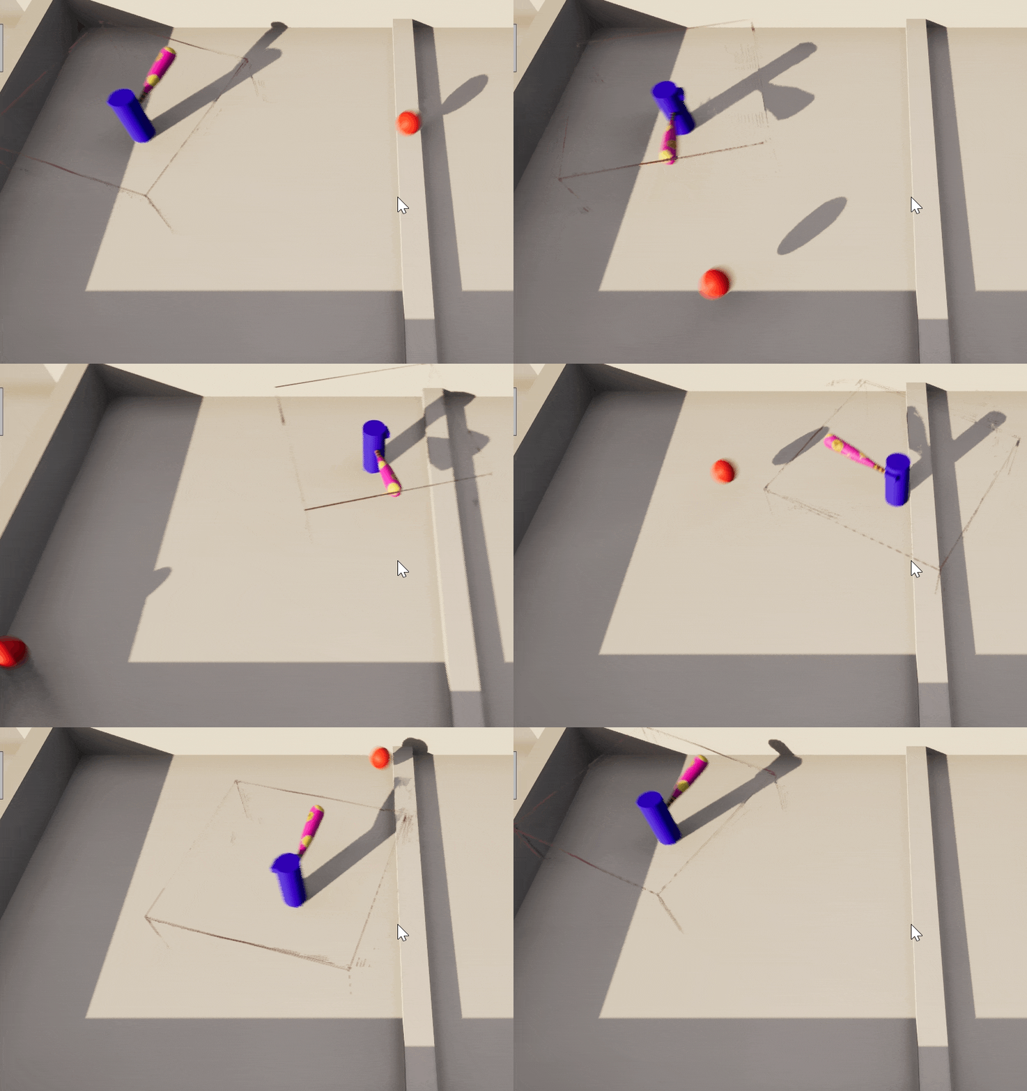
You can see the amazing Parry and Smash in action! Also, notice how the ball is getting colored to the team color! The ball can't hit you when colored to your team's color. Now it is a task for you to explore all new possibilities to outplay your opponent!
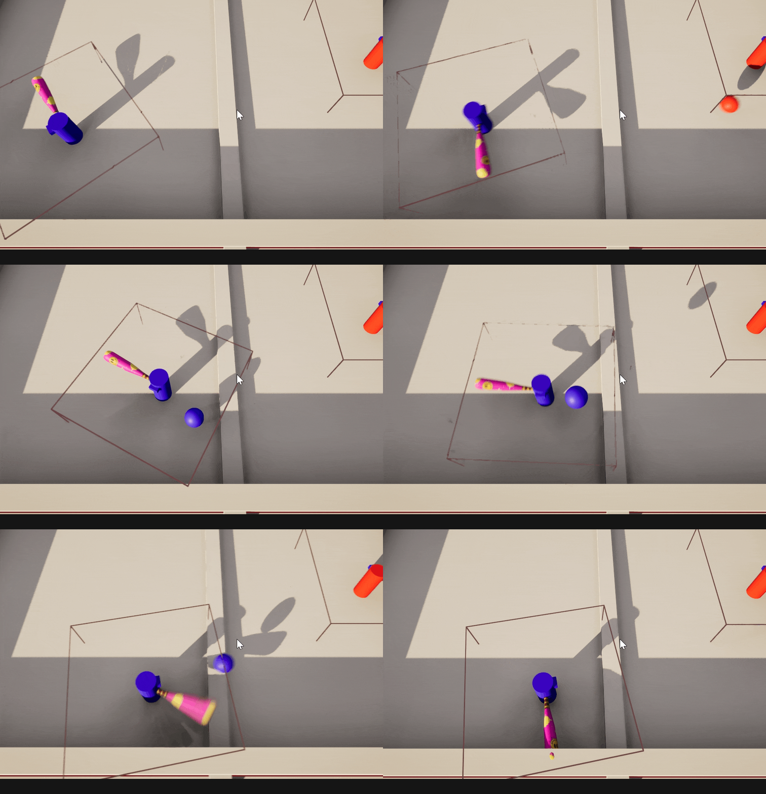
Even the Dodge is there to save you from the dangerous balls!
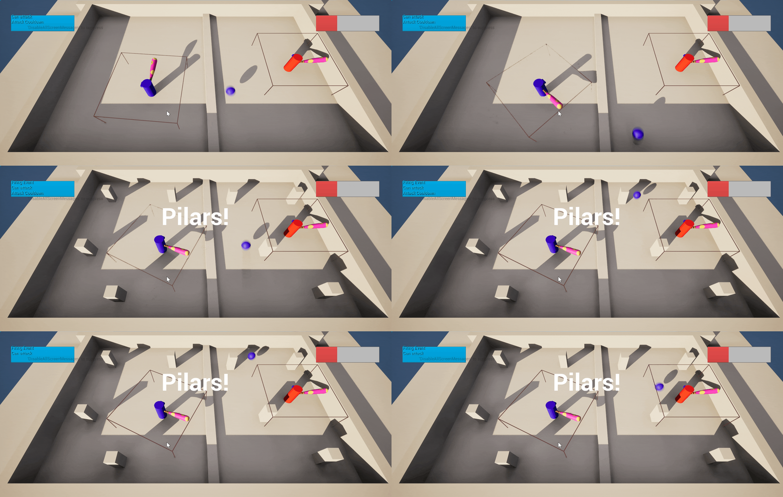
Also, we have some updates on the UI side!
We implemented the block out of the Main menu

And it was finally the time to have some Event Warnings and Health Bars!
It was quite a challenging week for us. A lot of work was done behind the scenes. We had to rethink a lot of game design decisions, fix bugs, and fine-tune the logic. But in the end, it's all worth it. We are extremely passionate about our project and 100 percent ready to enter the production stage!
Oh, almost forgot to mention that we changed the name of our game from 'BoomerBall' to 'Hyper Neon+' !
We hope you like the name as much as we do!
But we'll see you next week for more updates on our project! Thank you for reading our devlog!
-Team Hyper Neon+ (Boomers)
Get HyperNeon+
HyperNeon+
Dive into the Neon-Drenched Arena Where Machines Brawl for Glory. Will you be the next HyperChampion?
| Status | Released |
| Authors | Llandslide, imbajuk, SahinZ, YuukiOokami, shash-wut |
| Genre | Fighting, Action |
| Tags | 3D, Arcade, Retro, Superpowers, Top-Down, Unreal Engine, Urban |
| Languages | English |
More posts
- Final DevlogMay 26, 2024
- Tenth Week of DevelopmentMay 23, 2024
- Ninth Week Of DevelopmentMay 16, 2024
- Eighth week of developmentMay 08, 2024
- Seventh week of developmentMay 02, 2024
- Sixth week of developmentApr 25, 2024
- Fifth week of developmentApr 18, 2024
- Fourth week of developmentMar 28, 2024
- Second Week Of DevelopmentMar 14, 2024
Leave a comment
Log in with itch.io to leave a comment.